Will I still need a desktop version for my website in 2024?
In today’s rapidly evolving digital landscape, the question of maintaining a desktop version of a website is more pertinent than ever. As we approach 2024, businesses and web developers are re-evaluating the necessity of supporting traditional desktop interfaces in favor of increasingly popular mobile formats. This shift raises several considerations that need to be addressed to make informed decisions about website design and functionality. This article delves into five critical aspects that are shaping the debate: Mobile Traffic Trends, User Experience (UX) Design, Responsive Web Design, SEO and Website Visibility, and Maintenance and Development Costs.
Firstly, understanding the current Mobile Traffic Trends is crucial as the number of users accessing the internet via mobile devices continues to climb, potentially diminishing the role of desktop sites. Secondly, User Experience (UX) Design focuses on the differences in user behavior across devices and how this impacts the overall effectiveness of a site. Thirdly, Responsive Web Design is pivotal in creating a site adaptable across various devices without necessitating multiple versions. Fourthly, we consider how SEO and Website Visibility are affected by the choice between mobile and desktop versions, as search engines increasingly prioritize mobile-friendly sites. Finally, the Maintenance and Development Costs associated with running parallel versions for different devices can influence the decision on whether to continue supporting a desktop site. By exploring these topics, this article aims to provide a comprehensive overview of whether a desktop version remains a necessity in 2024 or if the scales have tipped entirely towards mobile-first strategies.

Mobile Traffic Trends
In the context of whether a desktop version of a website is still necessary in 2024, understanding mobile traffic trends is crucial. Over the past decade, the surge in mobile device usage has significantly shifted how users interact with digital content. Smartphones and tablets have become the primary means of internet access for a large portion of the global population. This shift is driven by the convenience and portability of mobile devices, allowing users to access information and services on-the-go.
Statistical insights reveal that mobile traffic has surpassed desktop traffic in many parts of the world. Businesses and web developers must consider these trends when planning their digital strategies. This doesn’t necessarily mean that desktop versions of websites will become obsolete, but it does signal a need for a balanced approach. A mobile-first strategy is often recommended, whereby the design and functionality are optimized for mobile devices first, while also ensuring that the desktop experience remains robust and fully functional.
For industries where detailed and complex interactions are common, such as in B2B sectors, finance, or advanced educational services, the desktop version of a website remains critical. These platforms often require a larger screen and more complex user interfaces, which are more comfortably navigated on a desktop. Hence, while mobile optimization is crucial, maintaining an effective desktop version is equally important to accommodate all user preferences and requirements.
In conclusion, mobile traffic trends strongly influence the necessity and design of desktop versions of websites. While the emphasis on mobile-friendly design grows, the need for desktop versions persists, especially in scenarios requiring detailed user interactions. Keeping a close eye on these trends will help in making informed decisions about web design and audience targeting in 2024 and beyond.
User Experience (UX) Design
User Experience (UX) Design is a vital aspect to consider when deciding whether to maintain a desktop version of a website in 2024. UX design focuses on ensuring that users have a seamless, intuitive, and satisfying interaction with products, which in the context of websites, translates to how easily and enjoyably users can navigate and achieve their goals.
In recent years, there has been a significant shift towards mobile-first design, influenced by increasing mobile internet usage. However, this does not eliminate the need for a well-thought-out UX on desktop versions. Different devices offer different user experiences due to factors like screen size, resolution, and user context. Desktops, for instance, provide a larger visual and interactive space, which can be crucial for detailed tasks or when users expect a more comprehensive view of information.
Moreover, certain user demographics or professions may still prefer desktops for more complex tasks or in work environments. For example, tasks that involve heavy data input, extensive reading, or detailed graphic design often benefit from the broader display and more robust input capabilities of desktops.
Thus, while mobile UX design is crucial, ensuring a quality desktop UX remains relevant. A well-designed desktop site can complement a mobile site by providing an enhanced, comfortable, and efficient experience for those who prefer or need to use a desktop. This approach not only broadens the accessibility of your website to a wider audience but also caters to specific user needs, potentially improving overall engagement and satisfaction.
Responsive Web Design
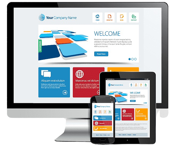
Responsive web design is a crucial aspect to consider when debating whether a desktop version of a website is still necessary in 2024. This approach ensures that a website provides an optimal viewing experience—easy reading and navigation with a minimum of resizing, panning, and scrolling—across a wide range of devices (from desktop computer monitors to mobile phones). The core of responsive web design lies in its flexibility; the site’s content and layout automatically adjust to the screen size on which it is viewed.
The adoption of responsive web design is driven by the increasing use of mobile devices to access the internet. As more people use smartphones and tablets as their primary means for accessing the web, it’s become essential for websites to accommodate these devices effectively. By implementing responsive design, a website can cater to both mobile and desktop users with a single solution, eliminating the need to maintain separate versions of a website for different device types.
Moreover, responsive web design is not only about adjusting to screen sizes but also about considering the different contexts in which mobile and desktop devices are used. Desktops might still be preferred for more complex tasks or situations where detailed information needs to be processed, suggesting that the role of desktop-friendly design isn’t disappearing anytime soon. However, the balance is shifting, and the importance of adaptable, responsive design that serves all devices equally well cannot be understated.
In summary, while the trend is moving towards mobile-first or even mobile-only web access, the necessity for maintaining a desktop version of a website remains—but perhaps not in the traditional sense. Instead of creating entirely separate designs for desktop and mobile, a unified approach through responsive web design can ensure that all users, regardless of their device, have a positive and effective interaction with your website. This approach future-proofs your website as device preferences continue to evolve.
SEO and Website Visibility
SEO, or Search Engine Optimization, plays a crucial role in the success of any website. It involves a set of practices designed to improve a site’s visibility in search engine results, thereby driving more organic traffic. As we look towards 2024, the need for a desktop version of your website remains significant, largely due to its impact on SEO and overall website visibility.
Desktop versions of websites typically provide more space for detailed content, complex features, and multimedia elements, which can all contribute positively to SEO. Search engines like Google often reward websites that offer rich, informative content and a good user experience, which includes fast loading times, easy navigation, and accessibility. While mobile-first indexing prioritizes the mobile version of your site for ranking purposes, having a robust desktop version can complement this by enhancing the depth and quality of the content available.
Moreover, desktop websites allow for more sophisticated SEO strategies, including advanced technical optimizations that might be limited or not feasible on mobile platforms. For instance, certain interactive features and forms of content that perform well on desktop might engage users longer, decreasing bounce rates and increasing time on site, both of which are important metrics for SEO.
In conclusion, while the importance of mobile-friendly websites continues to grow, the desktop version still holds substantial value for SEO and website visibility. Businesses aiming to maximize their reach and search engine rankings should not neglect the development and optimization of their desktop sites as we move into 2024 and beyond. Balancing both versions strategically will provide the most comprehensive benefits for website visibility in the evolving digital landscape.
Maintenance and Development Costs
Understanding the implications of maintenance and development costs is essential when considering whether you’ll need a desktop version of your website in 2024. As the digital landscape evolves, the cost of maintaining multiple versions of a website—specifically desktop and mobile—can be significant. Typically, having separate versions for desktop and mobile requires additional time and resources in both development and maintenance phases. This dual approach increases the overall expenditure compared to a single, responsive design that adapitates seamlessly across all devices.
With the advancement of web technologies, notably HTML5, CSS3, and JavaScript frameworks, developing a responsive website that adjusts to the screen size of the device has become more cost-effective. These technologies allow for smoother user experiences and easier maintenance compared to managing distinct versions of a site. By focusing on a responsive design, you can allocate your development budget more efficiently, potentially lowering the overall costs associated with updates, troubleshooting, and optimization across various platforms.
Furthermore, the shift towards mobile-first indexing by search engines like Google emphasizes the importance of having a mobile-friendly website. This approach can indirectly affect the costs of maintaining a desktop-specific version, as it may require additional SEO strategies and updates to ensure visibility and high ranking in search results. Therefore, by 2024, it might be more economical and strategic to invest in a robust responsive design that serves all users well, regardless of the device they use to access your site. This not only optimizes your development budget but also aligns with the ongoing trends and expectations in web development.