How could website building in 2024 cater to different screen sizes and devices?
As we transition into the digital era, the way we consume content online is rapidly evolving. With the advent of various devices and screen sizes, website building in 2024 needs to cater to all these different platforms for an optimal user experience. This article delves into how website building could adapt to the changing landscape of devices and screen sizes in 2024.
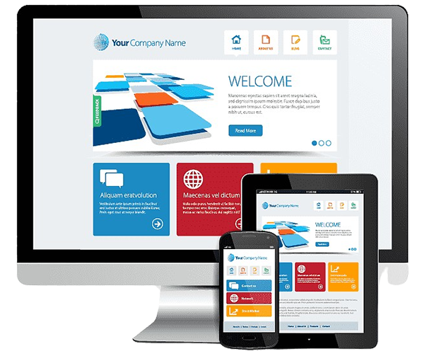
The first aspect to consider is the Responsive Design in Website Building for 2024. With users accessing websites from a myriad of devices, from small handheld smartphones to large desktop monitors, responsive design is more crucial than ever. It ensures that websites render correctly and provide a seamless experience, regardless of the device or screen size a user may be using.
Next, we’ll take a look at the upcoming screen size trends in 2024 and their impact on website design. As technology continues to advance, screen sizes and resolutions are continually evolving, creating new challenges and opportunities for website designers.
The third subtopic of discussion is strategies for adaptive design for different devices in 2024. Adaptive design focuses on tailoring the website layout to the specific device being used, providing a customized experience for each user based on their device.
We will then delve into the role of CSS and HTML in website adaptability for various screen sizes in 2024. These coding languages form the backbone of any website, and their proper use can significantly affect a website’s adaptability to different screen sizes.
Lastly, we will explore how incorporating User Experience (UX) and User Interface (UI) design for different devices can enhance website building in 2024. UX and UI design principles ensure that the website is not only visually appealing but also user-friendly, intuitive, and accessible across the broad spectrum of devices in use today.
By understanding these key aspects, website builders in 2024 could design sites that cater to different screen sizes and devices, ensuring a superior user experience for everyone.

Responsive Design in Website Building for 2024
Responsive design is a crucial element in website building, especially as we head towards 2024. With the rise of various screen sizes and devices, the need for websites to adapt and function seamlessly across all platforms is becoming increasingly important.
In the past, developers would create different versions of a website for different devices. However, this approach is no longer feasible due to the vast array of devices and screen sizes available today. This is where responsive design comes in. It allows websites to adjust their layout based on the screen size and orientation of the device being used. This ensures a consistent user experience, regardless of the device.
As we look towards 2024, we can expect responsive design to become even more essential. With the advancement of technology, new devices with varying screen sizes are being launched regularly. Moreover, users are becoming more tech-savvy and demand a seamless online experience. Therefore, web developers must incorporate responsive design into their website building process to ensure compatibility with all devices.
Furthermore, search engines like Google are now prioritizing mobile-friendly websites in their search results, making responsive design all the more important. Not only does it improve the user experience, but it also helps in improving a website’s search engine ranking.
In conclusion, responsive design in website building is expected to play a prominent role in 2024. It caters to different screen sizes and devices, ensuring a seamless user experience and improving search engine rankings. As technology continues to evolve, we can expect to see more advancements in this area.
Upcoming Screen Size Trends in 2024 and their Impact on Website Design
The evolution of digital technology has always had a significant impact on website design. With the upcoming screen size trends in 2024, website building will have to adapt to these changes. One of the key aspects to consider is the variety of devices that people use to access the internet. From smartphones to tablets, laptops, and even smart TVs, each device comes with different screen sizes. This presents a challenge for website builders to create a design that is both aesthetically pleasing and functional across all these devices.
In 2024, it is predicted that mobile devices will continue to dominate the digital landscape. Therefore, the importance of mobile-first design cannot be overstated. The trend of larger screens on mobile devices is also expected to continue, which means that designers will have to think about how to effectively use this extra space. One strategy could be to create more immersive experiences, with larger images and videos.
In addition to mobile devices, the use of smart TVs to browse the internet is also on the rise. This means that website builders will have to consider larger screen sizes, which can range from 32 inches to 65 inches or more. Designing for these screens will require a different approach, as the viewing distance is much greater compared to other devices. This could lead to the use of larger text sizes and more minimalistic designs.
Overall, the upcoming screen size trends in 2024 will have a profound impact on website design. It will require website builders to be more flexible and adaptive, ensuring that their designs provide a seamless user experience across all devices and screen sizes.
Strategies for Adaptive Design for Different Devices in 2024
In the context of website building in 2024, the third item, “Strategies for Adaptive Design for Different Devices,” is a subtopic of immense importance. As the variety of screen sizes and devices continues to grow, the need for effective strategies for adaptive design becomes increasingly significant. Adaptive design refers to the approach of designing websites so that they can change and adapt depending on the device they are being viewed on. This includes adjusting layout, navigation, images, and other elements to ensure optimal viewing and interaction experience.
One of the key strategies for adaptive design is the use of media queries. These are rules that apply different style rules for different media types and conditions. They allow developers to specify different styles for different devices, ensuring that a website looks good no matter what device it is viewed on.
Another important strategy is the use of flexible layouts. Rather than defining widths and heights in pixels, which are fixed units, flexible layouts define these dimensions in relative units, such as percentages. This allows the layout to adjust to the screen size of the device.
Furthermore, responsive images are another crucial aspect of adaptive design. These are images that can change not only their size, but also their resolution, depending on the screen size and resolution of the device. This ensures that images always look their best and load as quickly as possible.
Lastly, testing is a critical part of any adaptive design strategy. This involves testing the website on a variety of devices and screen sizes to ensure it works well on all of them. With the proliferation of devices, this can be a challenging task, but it is essential for delivering a high-quality user experience.
In conclusion, as we look towards website building in 2024, strategies for adaptive design for different devices will play a pivotal role in catering to different screen sizes. Through techniques such as media queries, flexible layouts, responsive images, and thorough testing, developers can ensure their websites provide an optimal viewing experience on any device.
Role of CSS and HTML in Website Adaptability for Various Screen Sizes in 2024
In the context of website building in 2024, the role of CSS (Cascading Style Sheets) and HTML (HyperText Markup Language) in ensuring adaptability for various screen sizes is crucial. These two coding languages are fundamental to the layout, design, and functionality of all websites.
CSS, in particular, has features that allow for responsive and adaptive design. Media queries, for example, are a CSS technique that enables the application of different style rules for different devices based on characteristics, such as screen size and resolution. In 2024, the use of CSS grid layouts and flexbox models can further enhance the adaptability of websites to different screen sizes. These CSS techniques enable the creation of complex web layouts that can easily adjust to the width and height of the viewing device.
HTML, on the other hand, provides the basic structure of the websites. In conjunction with CSS, it can be used to ensure that the structure of the site remains consistent across different screen sizes. Semantic HTML5 elements, like header, nav, and section, can be used to create a logical, organized structure that is easily interpreted by both users and search engines.
Moreover, the collaboration of HTML and CSS can create a dynamic viewport, a powerful tool in responsive design. The viewport meta tag in the HTML head, together with CSS media queries, can control layout on a variety of screen sizes.
In conclusion, the role of CSS and HTML in website adaptability for various screen sizes in 2024 is to provide a flexible and efficient method of creating websites that can adjust to different devices. By utilizing the advanced features of these languages, web developers can ensure a seamless browsing experience, regardless of the device used.
Incorporating User Experience (UX) and User Interface (UI) Design for Different Devices in 2024 Website Building
Incorporating User Experience (UX) and User Interface (UI) Design into website building for different devices in 2024 is a crucial aspect of the digital industry. As technology continues to advance, the diversity of screen sizes and devices is expected to grow, making it even more essential for designers and developers to consider these aspects during the website building process.
UX design focuses on the interaction between real human users and everyday products and services, such as websites. It’s about making a website as easy, efficient, and enjoyable as possible to use. On the other hand, UI design is about the look and feel, the presentation, and the interactivity of a product. Both UX and UI design are key to ensuring a website is not only visually appealing but also user-friendly, irrespective of the device or screen size being used.
In 2024, with the proliferation of different screen sizes and devices, UX/UI design in website building will need to be more adaptive and flexible. Designers will need to ensure that websites are not only responsive but also provide a consistent and seamless user experience across all devices. This means paying attention to factors like navigation, readability, and load times, which can all impact how a user interacts with a website.
Moreover, as more people use mobile devices to access the internet, mobile-first design strategies will become even more important. Designers will need to ensure that websites not only look good on smaller screens but are also easy to navigate and interact with. This could involve designing for touch interfaces, optimizing images and other media for faster loads on mobile data, and prioritizing content to show the most important information first.
Therefore, incorporating UX and UI design in website building for different devices in 2024 will be key to ensuring that websites are not only aesthetically pleasing but also functional and user-friendly, regardless of the device or screen size being used.